Based on my lightning talk at UX Open 2015. Also available in Swedish. Update: I was given the opportunity to present this talk in English at UXLx in 2016 (video available).
Once upon a time, in the land of Carefree, there lived a little girl named Leeloo. But everyone called her Red Riding-Hood as she always wore an old red, grungy hoodie. She was getting a bit tired of always being Red Riding-Hood though. She was thinking of renewing herself. In fact, for the next time she was going to visit her grandmother, she had it in her mind to buy a good-looking green hoodie instead.
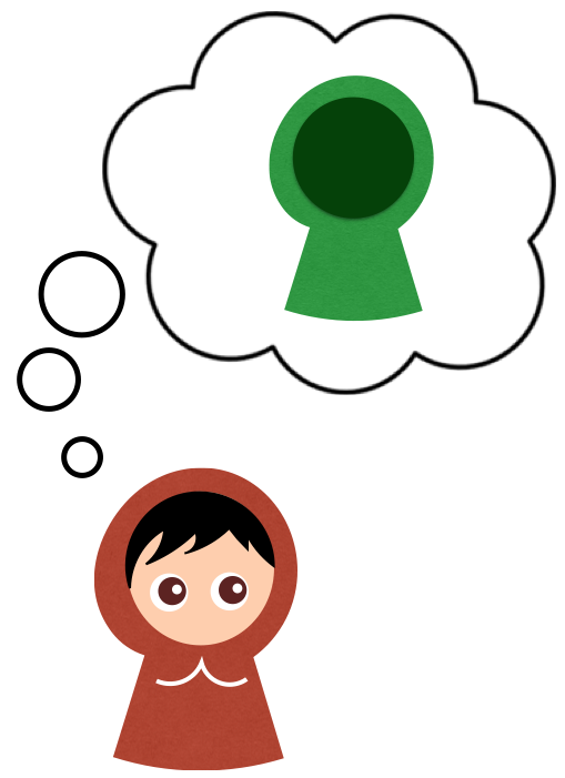
She used the Bling search engine and soon found Úlfur’s Woolies. The perfect hoodie was on the start page! With a quick click she ordered the green hoodie, her address was filled in automatically and the money would simply be charged from her PreyPal account.
Three easy, fast clicks!
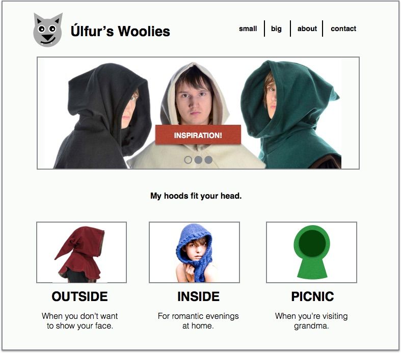

But when she later read the confirmation message the carrier pigeon brought, Leeloo understood that the shipping costs would be considerably higher than she had first noticed, and the final delivery date meant she actually wouldn’t get her green hoodie in time for her trip to her grandmother’s.
What’s the problem? The website worked really well. All usability testing showed users managing their tasks supremely. And the conversion rate over time is terrific.
So why is Leeloo sad?

Our most common view of UX tends to be easily explained. A user wants to get from A to B. By making this a good experience the user will feel pleased, happy, best case scenario even excited all the way to the target. Thus we have succeeded.

Because what a let-down it would be should the user feel doubt, frustration, confusion or surprise.

Obviously, that’s what we are fighting. Stuff we call friction and barriers. Barriers that keep users from reaching the goal.
Preferably the whole experience should be like a slip-n-slide, we enter at point A and glide swiftly to point B. The website should sweep us off our feet!
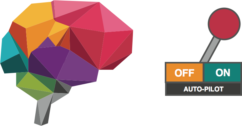
But what really goes on in our brains when something is easy? What does the brain do when something is so easy it becomes intuitively simple? It switches over to auto-pilot. We allow our brains save energy. And that is formidably efficient. If your job is to flip the bathroom light-switch. But when our decisions are impacting our well-being the auto-pilot perhaps is not our best friend.
Have you ever used Amazon 1-click ordering? One button that that allows me to buy books with a single click. A single click. What happened for me when I activated this functionality was as predictable as it was sense-less: I bought a lot of books. When I got wind of a new book I didn’t just write it on a list, I actually just went into the Amazon website and pressed “Buy now with 1- Click.” It was titillating! It really is just one click, money gets pulled from your credit card and the book is shipped.

This turned out to be expensive, and administratively inconvenient for me; each book got its own receipt. When I realized what I was doing, 20 books and 20 receipts later, I turned it off.
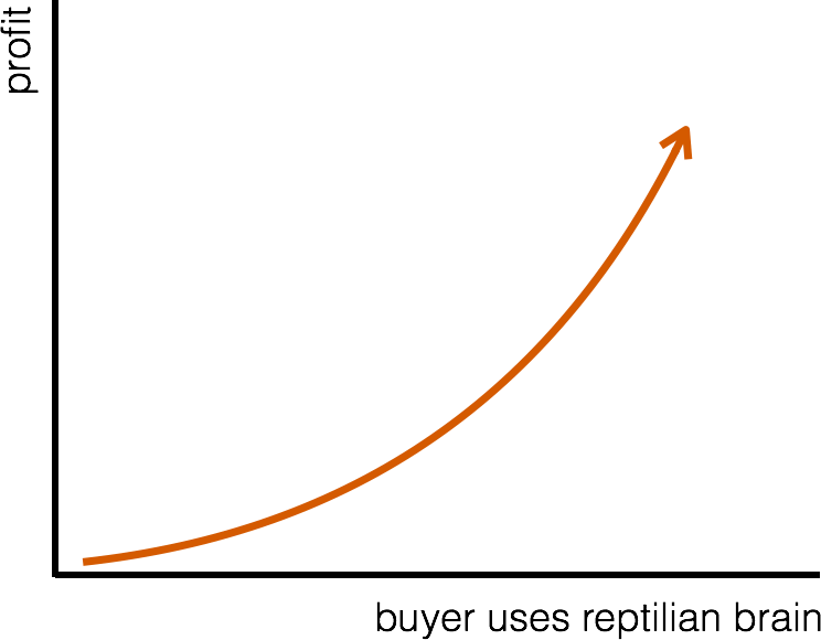
For Amazon this is of course incredible profitable. But since when did UX professionals become conversion consultants?
When did UX practitioners become conversion optimizers who only focus on A/B-tests and the fastest route to the bottom line?
What I want you to reflect on is what pact you feel you have made with users. We who work within UX say we wish the best for the users of any system we are working with. We even like to say we are creating a better world for people. I know that the driving force for working with UX is human-centric. I’m afraid many of us are failing that promise.
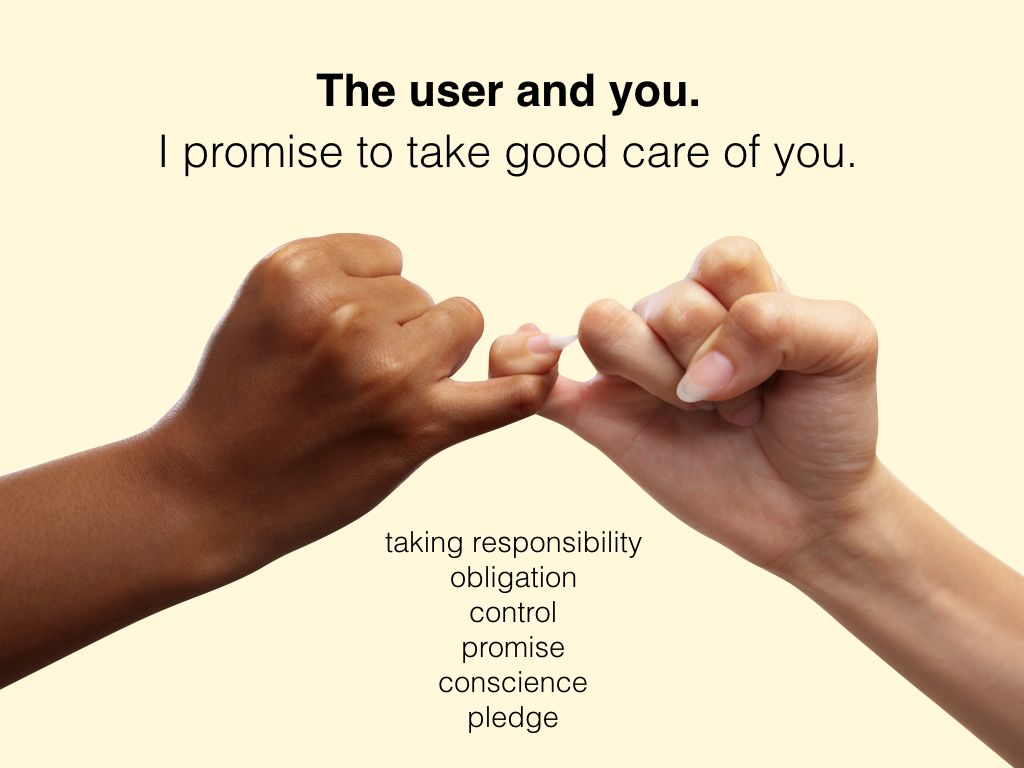
When the primary focus is easy-flowing experiences we are in the danger zone of creating cheap-line articles that hide important information and do not at all lead to pleased users, only happy salespeople.
Let me give you some examples of when disappointment arrives in the wash of simplifications:
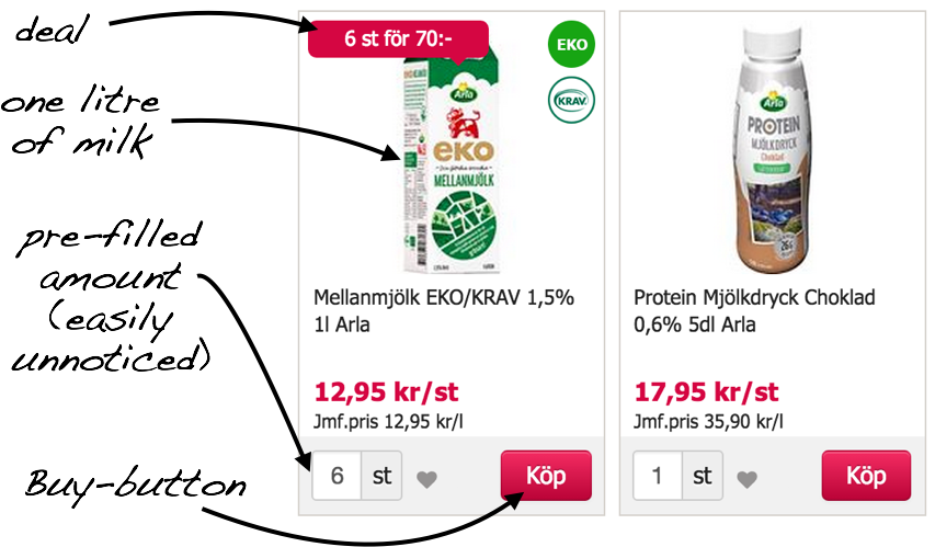
In Sweden we have the lovely Mathem.se for grocery shopping. Sometimes they give great deals like this one: 6 litres of milk for 70 kronor.
An easy way to add 3 litres of milk to the basket is to click 3 times on the Buy-button. The website really is that fast and efficient, and for a regular visitor this becomes routine.
In the case of the offer pictured above the picture is the same as always (with or without the deal), showcasing one (1) litre of milk. Since I use my eyes to process 70–80% of my cognitive input I click 3 times to get 3 litres of milk.
But when I click this button 3 times I actually get 18 litres of milk delivered, since Mathem have been kind enough to pre-fill the input with 6.
It feels fast and simple. My irritation only peaks at the point of delivery.
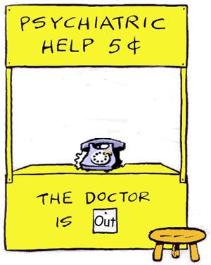
When I was involved in redesigning national online health services in Sweden we looked at some really great services that we knew users appreciated — and we made them a lot easier to reach and interact with. The service “Ask a psychiatrist” didn’t stand a chance of handling all the questions that ensued. The result was an inferior experience when many had to wait longer for the responses.
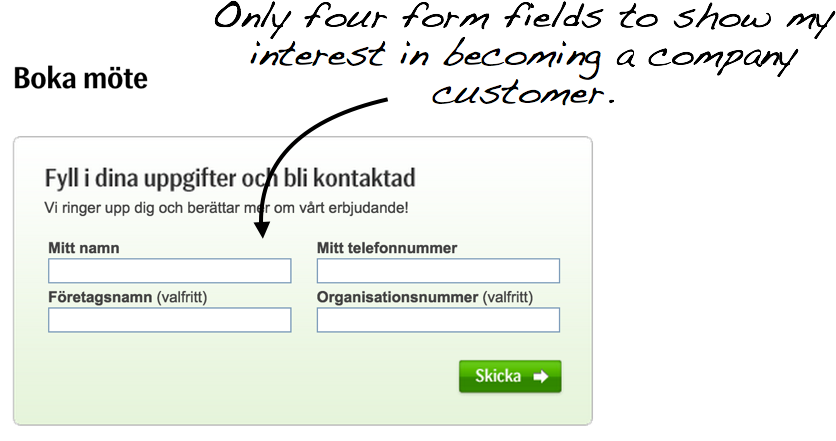
When I started my company the bank SEB had an exemplary form for becoming a customer. It took me 15 seconds to complete. Really swell. They never called me back and I never hired them. But the form was a piece of cake.

Many of us in the field of UX have quoted Gerry McGovern’s story starring a HSBC mortgage form. It was simplified from 17 to 3 form fields and the number of finalized mortgages via the form rose by thousands of percent.
However, we never hear about anyone asking how happy the people were with their loans. How many people incurred debt they could not handle or perhaps could have — based on their unique situation — gotten better terms or advice elsewhere?
Where do we draw the line for how easy something should be? Is it okay to keep optimizing and making it easier for anyone to, let’s say, obtain high-interest loans via text messages? What happens when it all becomes too easy, if anyone can just press a button and get anything? Thoughtfulness disappears. We click. Worst-case someone gets into trouble. But that’s not what we wanted.
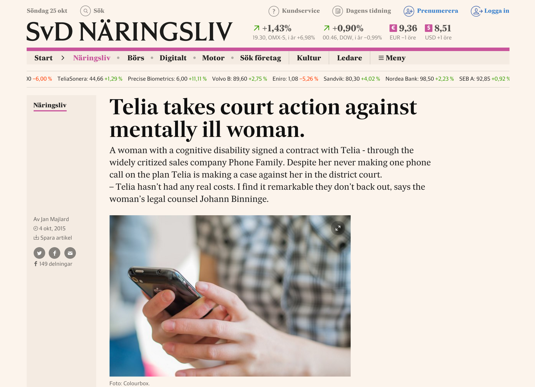
We must not, and shall not, act like the salespeople who sold the same woman — a woman with a cognitive disability — no less than four different cell phone plans that she never used. That should be far from how easy we want to aim for.
People are complex. A lot of stuff happens constantly in our lives. We are placed in front of an endless stream of decisions. Of course it’s nice when things are simple, and we do look for shortcuts, and for a chance to give the brain a rest. But we also have values and goals.
When our values and goals are adversely affected we feel bad. As a person responsible for UX you need to add this to your equation.
The risk now is that digital services will continue down the same path as other industries during the 20th century. We package deals pleasantly and hide the information that could give us clues about the what’s going on behind the scenes; how it really works.
In the UX industry we are all creators and contribute to the future we all share. The oil industry, the textile industry the food industry — they all endure copious criticism today. But of course most makers who have contributed to these industries have done so with the intent of working for the good of mankind, thought of themselves as moving in the right direction.
The food industry guides us in the art of presenting products in a pretty package, making them captivating, regardless of the eventual suffering behind the products or any adverse impact they may have on our health. Feature a cartoon tiger, slap on “33% less sugar” and watch the profits grow.

So when all websites begin to look the same, when we constantly optimize for eliminating obstacles, eliminating too much thought, what kind of world are we creating together?
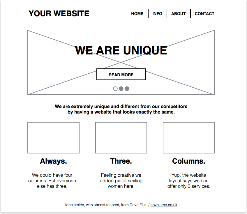
A world where I don’t stop to see if I’m on the right path.
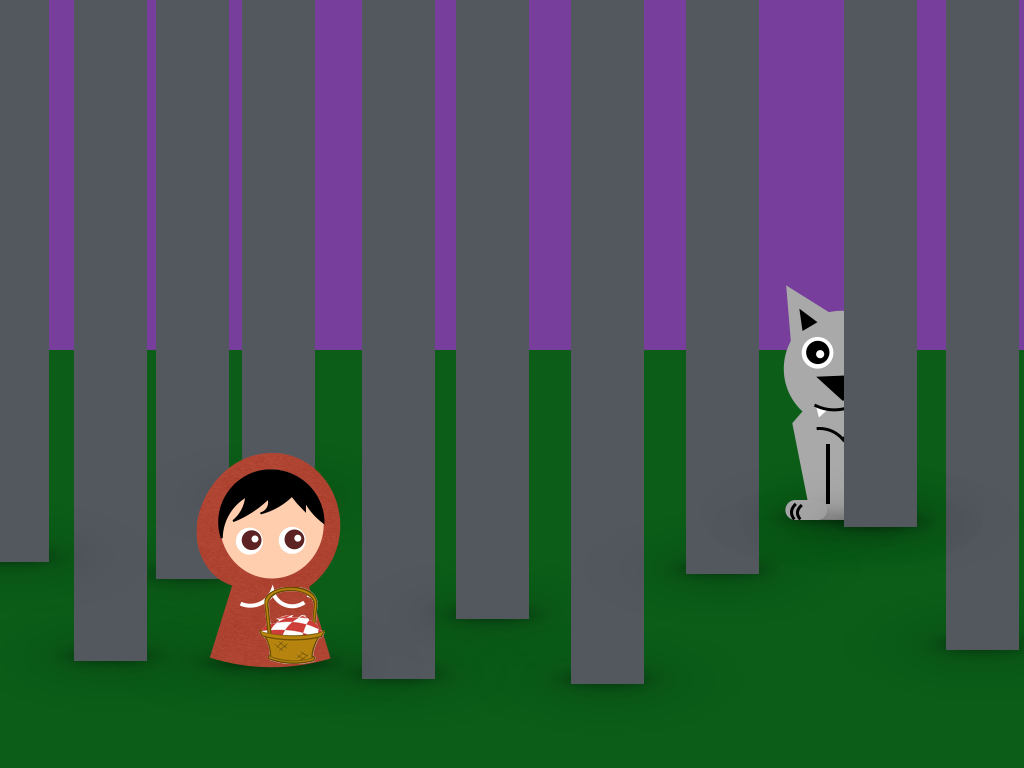
We are creating a world where disappointment is a result of a limited opportunity to reflect on your actions.
Because what is Leeloo’s goal, really? It’s not to buy a green hoodie. She is after the experience of showing her outfit to her grandmother. To redefine herself. To escape being Red Riding-Hood.

If we allow ourselves to shut off the auto-pilot, what could we accomplish?
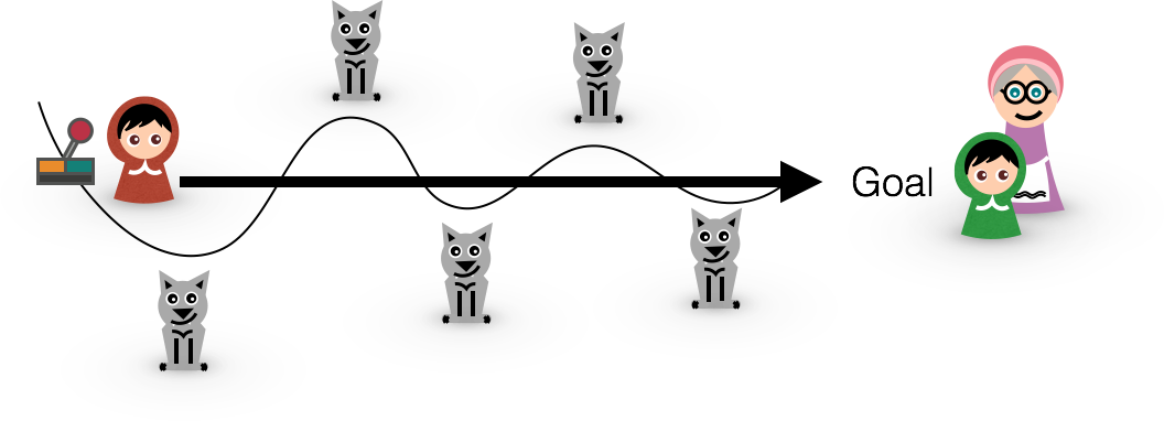
We can give Leeloo more opportunities on the way to her goal for considering if she is on the right path. Of course we still need to ensure a satisfying experience, but we can not solely regard this as a straight shot to the goal.
We add opportunities to think. Things that interrupt gently, highlighting things that will help her make more aware decisions. We give her more perceptible information and checkpoints.
In Leeloo’s case, little wolves.
Allow me to give you some examples of good friction and obstacles.Quite recently I got the question of why I had put a heading in capital letters. Nowhere else on the site did we have headings in capital letters. And within the question lies of course the answer: I did this precisely because I wanted to break the norm, to make users react to something different and give the heading more attention in this particular instance.
– But that’s not a consistent user experience?
I’ll let you in on a secret: Consistent user experience is newspeak for SWITCH OFF THE BRAIN.
Good friction provides guidance. But you need to know what should stick out. It’s good when important things get noticed.
Sometimes I ensure we add loading animations even though they — from a strict technical perspective — aren’t needed, when content could load instantly. I want to give users a clear signal that their effort is having effect. They get feedback on their input, and more time to think before being bombarded with a new pack of information. With a “visual obstacle” I show they have cleared one obstacle and are on their way to the next one.
This is an obvious situation where you give people more time to think and reflect over their actions.

People need a sense of achievement. It IS liberating to clear obstacles. THAT is an experience. You know who else adds obstacles to create a better experience? Game designers.
But I’ve saved my best example for last: A few weeks ago I was signing up with The Coaching House to allow me to rent rooms in my coaching practice. Everything took place online and it took me three days to get through the sign-up process. I’m not kidding. It’s a long process, but incredibly well thought-out. Among other things I got a discount if I was able to find the premise for the discount in the rules of conduct document.
In the end I had to watch an instruction video to receive a password! The password was given to me letter by letter, in 2 minute intervals in a talking head movie explaining my responsibilities as a customer. I could have given up any time but I persevered. I wanted what they were offering. To say the least, the people at The Coaching House get the customers they want: well-read, motivated and — with a high degree of probability — very well-behaved.
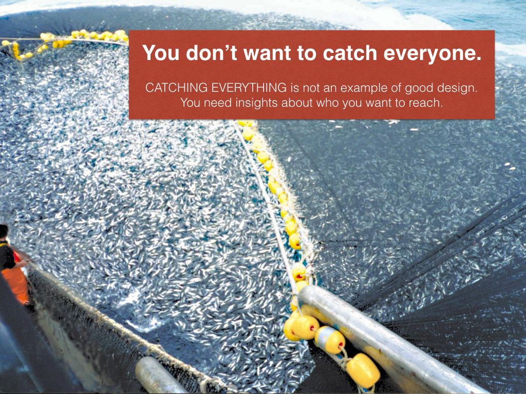
You don’t want to catch everyone, contrary to what many who design registration forms seem to think. To succeed you must understand who your customers and stakeholders are and how you can help them. That’s actually somewhat the point of a business plan. When you try to catch everyone you increase the likelihood of catching those who will cost you time and money. Words like refund, frustration, irritation and support organization can become too dominating in your everyday vocabulary.
To succeed you must also have a clear idea of where your loyalty lies.
And before you say “with the user”, I want to assert that this is also too narrow a view.
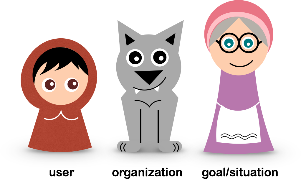
Your loyalty lies with the user as well the organization and the goal or circumstances. You need to help everyone see the value of Leeloo having her goal fulfilled.

When we hide that which helps the user think we can under certain conditions make more money but we also set the foundation for future disappointment. That is not a relationship based on mutual interests. It is not in line with my promise as a professional: to work for the good of the user giving her time to consider the offer in context with her values and goal.
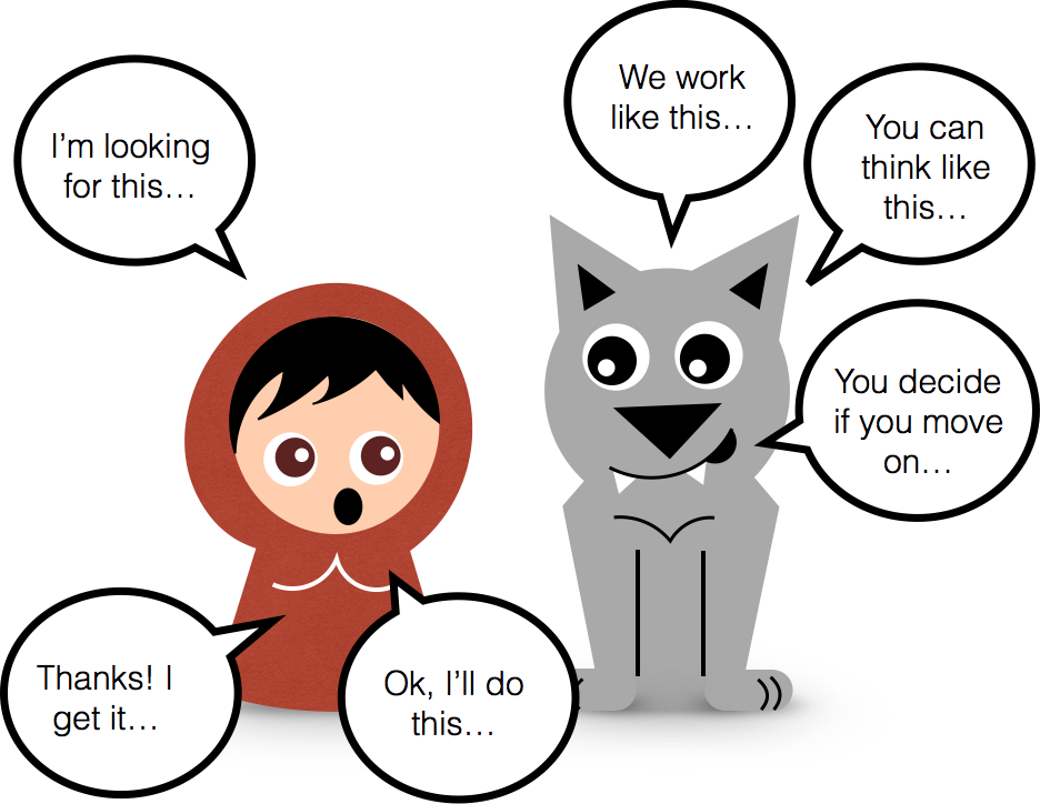
Only when we show respect for the real goal, and for the user’s right to reach her target, can we add friction that helps her make a decision with a higher level of awareness of the consequences. Only when we see the value of not only removing, but also adding friction, can we as UX professionals say we are contributing to a better world.
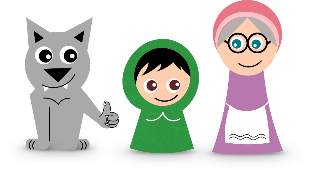
Only then can we live happily ever after.
Visit Fairy Tale Experiences talk at #UXLx to read some of the reactions I received form the audience.
Featured image: Charlie Barker, Litte Red Riding Hood
Article Tweets and Reactions
Now in English! The invisible problem with fairy tale experiences https://t.co/FxSRp2iTMl #ux #uxopen
— Per Axbom (@axbom) October 25, 2015
“To contribute to a better world, we need to see the value of not only removing, but also adding friction.” https://t.co/MwEhBtSJ68 #ux
— Artem (@clartem) October 26, 2015
Great article on ux - The invisible problem with fairy tale experiences https://t.co/7qf1X8MQHH via @axbom pic.twitter.com/Nd8ejg53qf
— BetterUX (@betterux_) October 26, 2015
This, a million times. Ethical designer's primary concern should be what is best for the users > https://t.co/yXwAiMmoIZ #ux Thanks @axbom
— Jeremias Ylirotu (@jeremiasylirotu) October 27, 2015
Great article on #ux - The invisible problem with fairy tale experiences https://t.co/Q5YGfLaos9 via @axbom
— FutureheadsJobs (@FutureheadsJobs) October 27, 2015
The invisible problem with fairy tale experiences | #ux #designer #strategy #problems https://t.co/4XHCaGRoSO
— Julia A Fowler (@JuliaAFowler) October 27, 2015
“You don’t want to catch everyone” https://t.co/uZOYoeNLsX
— Daniela Meleo (@danielameleo) October 27, 2015
The invisible problem with fairy tale experiences.
https://t.co/bkwZEGD0tC
— Tero A. Laiho 💙💛 (@LaihoTero) October 27, 2015
Let's not forget the ethics of the UX design.
Splendid article on #userexperience #UX #design : https://t.co/uBTSF1LkO3
— Dr. Hasan Tinmaz (@hasan_tinmaz) October 27, 2015


Member discussion