When friction is a good thing
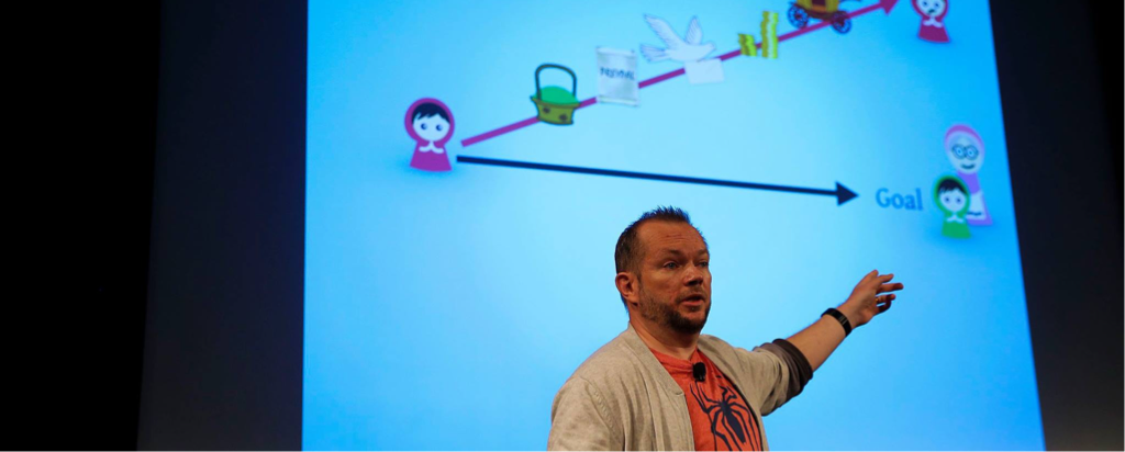
Last week I gave a talk at UX Lisbon entitled The Invisible Problem With Fairy Tale Experiences. It is a talk that challenges conventional wisdom within UX, specifically the claim that the role of user experience is to remove obstacles and friction.
I received lots of appreciation for the talk (thank you!) and many also started thinking differently already in the workshops they were attending the following day. I want to share some of the examples that were sent to me on Twitter, by Francois Jordaan and Louie A. Many of these examples were talked about in Giles Colborne’s workshop From Insight to Interaction.
- A cash counting machine from Coinstar. When it was working too fast users did not trust its accuracy. A delay was added, using an animated “loader”, and the problem of trust was largely removed.
- Airport baggage claim in Austin. When passengers complained about the wait at the carousel the walk to the baggage claim was routed to be five minutes longer. Complaints about waiting for the baggage disappeared.
- Online supermarkets. When there is no friction users only buy what they came for. By adding reminders and suggestions (in a sense friction) there is a chance that people will remember to buy more things they actually do need.
- Onboarding flow on Yammer/LinkedIn. By increasing the scope of a step-by-step guide for users the conversions went down but the users who did make it through contributed more relevant content.
- Create a blog on Blogger. When initially designed, pressing the “Create a Blog” button on Blogger.com set one up instantly for you. This caught users off-guard, with users exclaiming “That’s it? Is something wrong?”. To resolve confusion a loader screen was added with the message “Setting up your blog…”
- Onboarding in an app. A more lengthy onboarding guide will lower conversions but set the right expectations for a more complex interface.
- Waiting for coffee. How long would you wait? As it turns out, if you wait longer for coffee your perception of the coffee may actually be that it is better. There is, of course, a fine balance to this. Of course Starbucks could figure out how to make a Cappuccino faster… but do they want to?
Could this be true? The perceived value of coffee just in your head?
Things you can do on your website and apps.
- Swipe, don’t tap. By requiring a swipe action instead of just tap you can match this to more important actions where the user needs to exert more energy to perform the action.
- Loading screens. Let people wait, but clearly show the website is “working”. As mentioned above, people can have more trust in websites that demonstrate labor (essentially giving a tangible expression of the complexity going on behind the scenes).
- Onboarding. In my talk I gave an example of a company that gives out a password one letter per minute in a video of a person explaining the code of conduct. It may sound extreme but it works really well for that organisation.
I would like to stress that the driving force behind my talk is ethics. My role as a designer is for the user to reach her goal and not just enable the completion of a task. If my product won’t assist in this goal alignment this must be obvious to the user. If I can assist in bringing her closer to the goal, but with additional “pain” for the user such as extra costs, this should also be clearly communicated. Design creates win-wins for users and businesses, not just wins for one or the other.
When to add friction
The most common question people had for me after my talk was how they would decide when it is appropriate to add friction. I plan on addressing this challenge more in a longer blog post, but here is the short answer:
Besides the obvious usability tests, by doing regular risk assessments of the different pages and functions in your website you are taking clear responsibility for pinpointing where users could potentially have problems.
The key is to brainstorm as many different unwanted outcomes as possible. In my talk the risk would be for Leeloo to misunderstand delivery time and the unwanted outcome to have her hoodie delivered later than would serve her true goal. In my simplest risk assessment this would be scored on two variables: Probability (of it happening) and Severity (how much of a problem is it really).
By doing a risk assessment you uncover areas where you need to add measures to prevent the unwanted outcomes. More often than not these measures are exactly what we are talking about, adding more now to prevent disappointment later.
The scoring is helpful in assessing how big the problem is and how often you need to return to verify if the risk is eliminated or still present.
I’ll be adding many of these concepts to a Fairy Tale UX workshop.
Until then, what are some more examples you can think of? I would love for you to share them with me in the comments.