
The world map that reboots your brain
Most maps grossly misrepresent the size of countries and contribute to confusion. Let's revise our tools to help us get better results.

When talking about digital ethics I often begin with a run-through of how the tools, models and workflows we use are taken for granted, with rare concern for how they mislead. And the longer we use them the less they are questioned. In truth we really need to regularly revise and redesign all the tools we use. All tools simplify, which makes them vehicles for potential harm when the risks of oversimplification are not talked about, or worst-case: forgotten.
The world map is my go-to example. The flat, visual portrayal of the world in two dimensions based on the Mercator projection has been so commonplace in classrooms worldwide that this map is widely embedded in collective consciousness as a plausible truth. In my experience too few are taught to question it, even by their teachers. Which is disadvantageous of course, because the world – believe it or not – has never been flat.
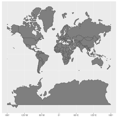
Here is the two-dimensional map you most likely know best, using the Mercator projection:
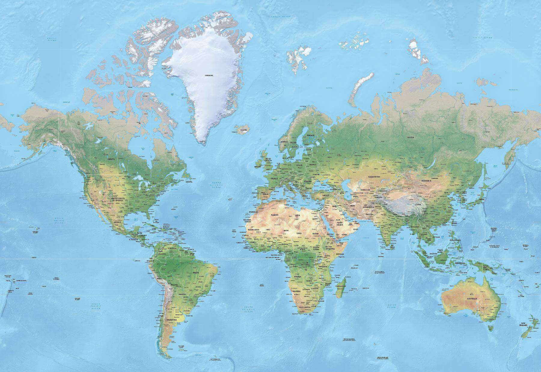
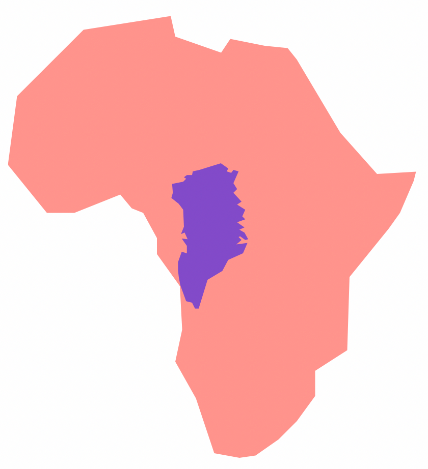
Consider your relationship to this map. In your head you likely use it to think about distances between countries, and of course the shapes and sizes of countries and continents. Greenland and Africa, for example, look to be essentially the same size. In reality of course Africa is about 14 times larger than Greenland.
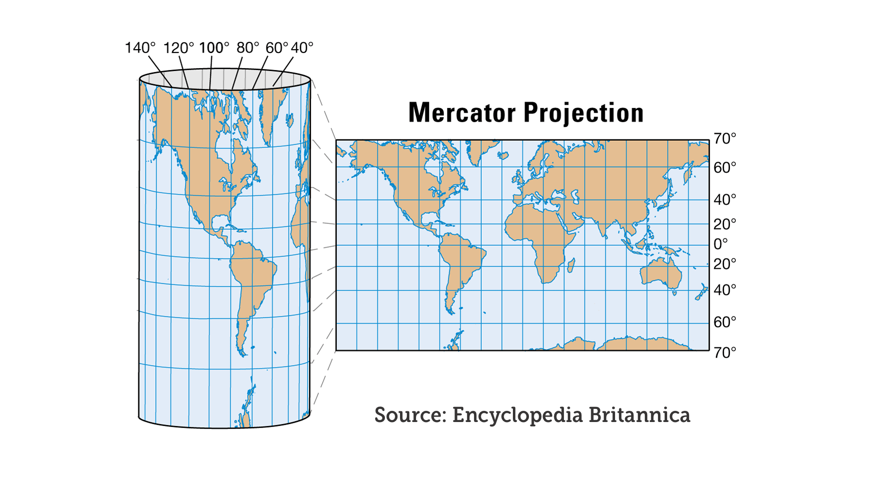
The Mercator projection was originally presented by Flemish geographer and cartographer Gerardus Mercator back in 1569. Its purpose was to be used for maritime navigation and it served this purpose well since throughout the projection North is up and South is down, while local shapes and directions are maintained. So when using this projection on a map scaled for navigational use it's easier to find your way.
This perhaps makes sense to you. But should it? Obviously, nobody puts a world map in their lap and navigates based on that. The Mercator projection is used for local navigation on a much smaller scale, where it makes sense. The world map is what happened when the same projection was extended to include the whole world.
Consider the full modern representation of a world map based on the Mercator projection that includes Antarctica. Remember, Antarctica hadn't yet been discovered when Mercator first introduced the map. Now, think about how long the top and bottom sides of the map are. They are just as long as the equator. That whole horizontal stretch of distance at the top and bottom should essentially be small dots. Those are the poles, where the north and south converge, respectively.
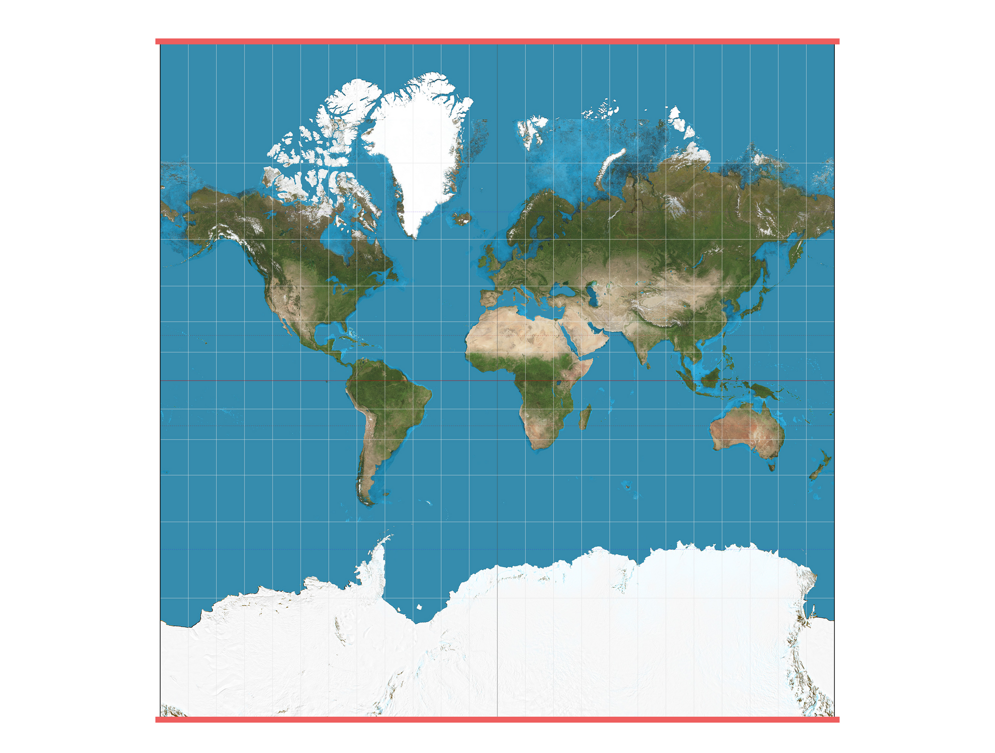
What is happening in the Mercator projection is that the further something is from the equator, the bigger it appears, because it is necessarily stretched out horizontally. A world map based on the Mercator projection is constructed as if the world was a cylinder rather than a globe. Antarctica is of course nowhere as big as it appears here.
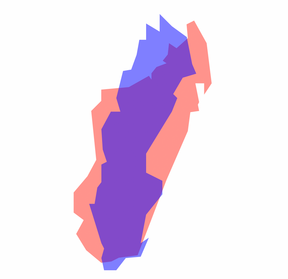
This also means that Europe and North America appear much larger than they really are in comparison to Central Africa and South America. Another favorite example of mine is Sweden superimposed on Madagascar. On a world map based on the Mercator projection Sweden appears to be at least twice the size of Madagascar. In reality, as shown below, Madagascar is 30% larger.
There is another non-intuitive effect of flattening the globe in this way. It's about how the curvature of the Earth is misrepresented. When drawing straight lines between countries they would in reality be curved and seemingly curved lines can in fact be mostly straight. Allow me to elaborate.
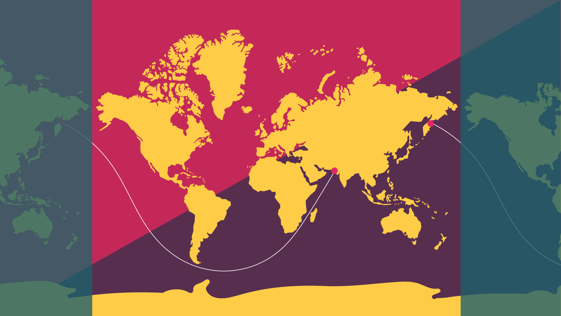
In my talks I show this image of the world where a curved line, almost like a sinus curve traverses the map. One end of the line starts in Pakistan and it passes between the African mainland and Madagascar, dips below Africa and South America, and ends up in Russia, in a place known as Kamchatka Karia.
I then ask: what is this line?
Many people are naturally stumped by this question. The answer is that this line represents the longest distance you can sail across the world in a straight line without hitting land. It represents a distance of 32,000 kilometres. And yes, you read that right: this is a straight line.
The assertion of this being the longest distance in a straight line across water originally came from Reddit user Patrick Anderson (kepleronlyknows) in 2012. It was later confirmed by researchers Rohan Chabukswar and Kushal Mukherjee in 2018.
To give you more evidence, in the video below this line is shown on a 3D representation of the globe using Google Earth. Here it becomes evident that the line is in fact straight.
If you have ever travelled on a long-distance flight you may have followed the flight path on a screen on the plane. You may have wondered why the flight path doesn't follow a straight line but instead appears curved. In reality the flight path is more straight (along the curvature of the earth) than you may suspect. It's the map that isn't straight.
As a further example of the skewed perspective provided by the Mercator projection, see the video below where I use the service thetruesize.com to show how Kenya, a country on the equator, would appear if it was further north or south on the map. The effect of the distortion is extremely clear as Kenya further north expands to almost the size of Greenland.
Addressing the problems
By making this the default map in classrooms for centuries, with little context given to the reasons for its appearance, many people have necessarily had a truly twisted view of what the world looks like. There have been many different projections proposed and presented over these centuries, but none have really gained the same popularity as the Mercator one.
Given that the people who claim ownership and ensure distribution of this map have historically been white and rich representatives of the countries in the northern hemisphere, we may have a clue to the reason for its persistence. Why would any of these representatives and leaders have wanted their countries to suddenly appear smaller in favor of poorer countries? But perhaps more obviously: the map is centered on Europe and is a source for adopting global east and west naming conventions.
Beyond a possible colonial preference of minimising the visual significance of South America, Africa and India, there are further dilemmas. In a world facing a climate crisis, understanding the interplay of weather phenomenons (and displacement of people as an effect of heat, drought, flooding and conflict) relies on a firm understanding of the world's systems and structure. While I doubt many scientists rely on the Mercator projection for this type of research, communicating important findings can prove challenging when the majority of the world has a deeply ingrained misunderstanding of the world's appearance.
Similarly, conflicts arise with regards to national ownership of water masses based on erroneous assumptions about size and relative distances.
Say hello to Authagraph
I first stumbled upon the Authagraph projection in 2016, but it was invented already in 1999. Japanese architect Hajime Narukawa proposed an innovative approach to mapping. In 2016 it earned him the Good Design Award.
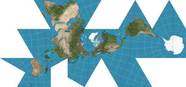
First of all, the map does a much better job at preserving the relative size and area of land and water masses, while reducing shape distortion. It is also designed to avoid dead ends, allowing the spherical nature of the world to be visualised by simply expanding the map in any direction. You can choose, and are encouraged to, center the map on any part of the world to ensure that your perspective is relevant to what you are trying to learn.
Here is an official version of the map centered on the Pacific Ocean, and another one below it centered on Europe. See if you recognize your part of the world and if this way of presenting the world gives you any aha moments.
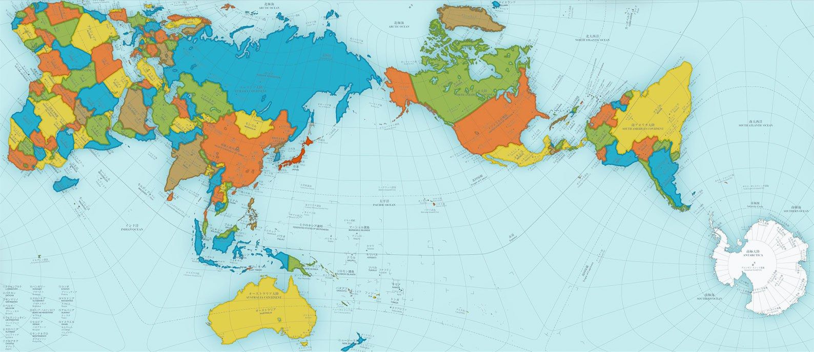
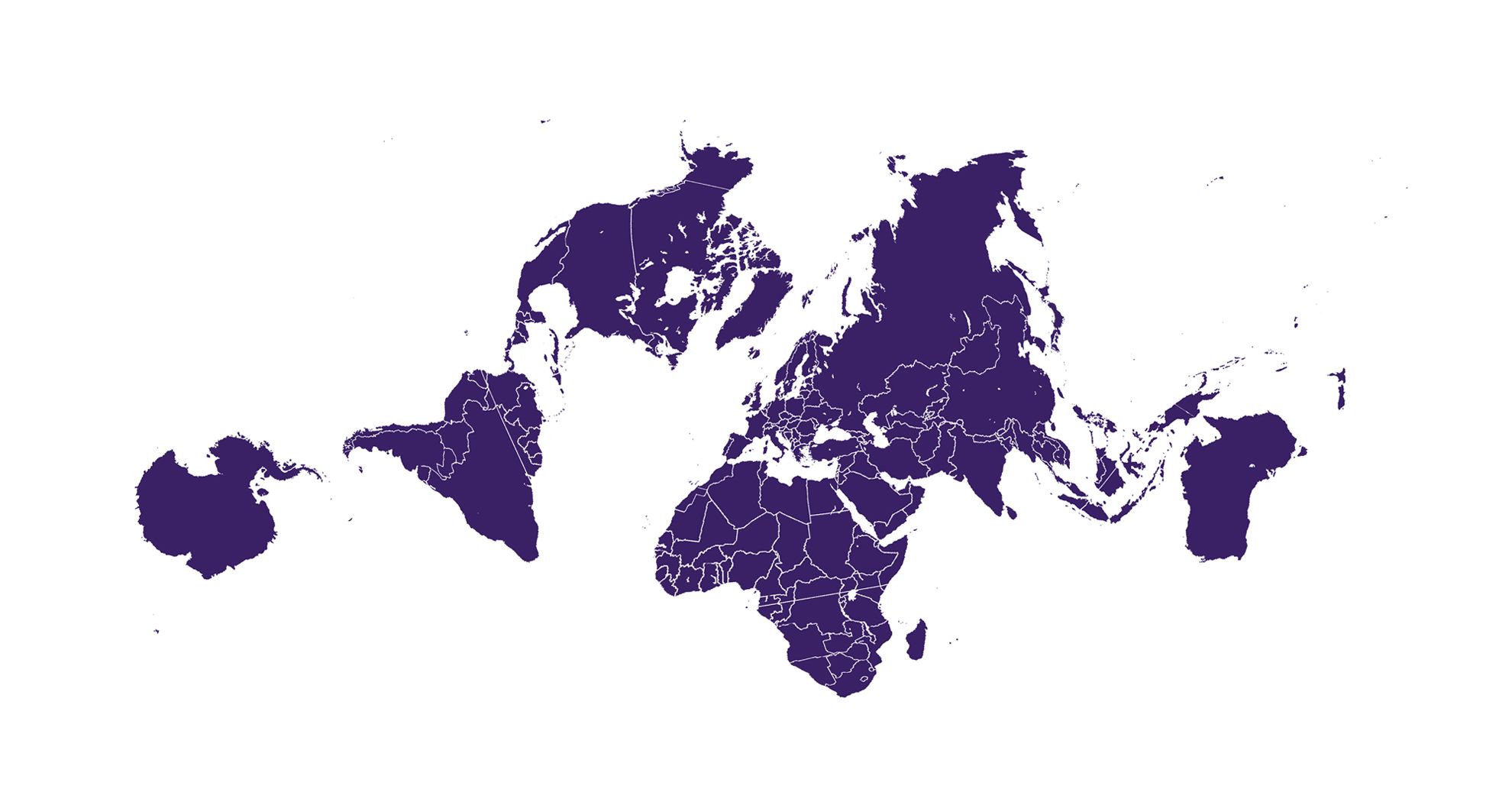
Illustration from Authagraph showing how one can choose one's own perspective from the expanded map, centering on the area of interest:
Granted, this map is still not perfect (it's still not a globe) but remains one of the best attempts yet at representing the world in flat, two dimensions. In a map based on this projection, Australia and Brazil suffer the most from distortion. The concept behind the map's tetrahedron roots are explained through the image below.

- A spherical surface is divided into 96 regions.
- The divided regions are mapped on 96 regions on an inflated tetrahedron while it maintains their area ratios.
- The divided regions on an inflated tetrahedron are flattened to be a tetrahedron while it maintains the area ratios.
- A rectangular world map is obtained by cutting out the tetrahedron.
- The obtained rectangular world map.
Sadly the Authagraph map is still a proprietary model, and its equations have not been released or published. So it can not easily be reproduced or used in GIS software. This of course has led many people to dismiss it completely. For a deeper dive, read this review of tetrahedral projections.
Takeaways
These are the key learnings my research on maps has brought me:
- Just because a tool is a huge success for one application does not mean it can be applied indiscriminately for other, seemingly related purposes.
- The longer we use a tool without questioning it, the more of a truth it becomes no matter how wrong it is.
- We can truly believe we understand a tool without really doing so.
- If we use a tool to navigate but don't understand where the tool is wrong, we can draw all the wrong conclusions and end up in bad places.
- We need to be always questioning and revising our tools and models to improve them for the purpose we are using them for.
- People will fight to maintain and keep a faulty tool if they appear to gain from it, even if they learn it is wrong. Be wary of tool colonisation efforts.
- Proprietary tools will face a much bigger struggle in gaining traction. If you want to help better the world, open source is your friend. Open source also opens up for incremental improvements through crowdsourcing.
Thank you for reading. I feel like this with this post I can claim to have changed the world for at least some number of people. Do share and help others gain new perspectives as well! 😊
Links and tools and other stuff related to the conundrum of map projections
Compare real sizes:
Videos
Nick Finck pointed me to this hilarious scene from the TV series The West Wing, where representatives from The Organization of Cartographers for Social Equality argue for the Gall-Peters projection map to replace the Mercator projection.
Other projections of note
Dymaxion
- Several people have noted that the Authagraph reminds them of the Dymaxion. In several reviews I have seen people mention that the Authagraph indeed seems inspired by the Dymaxion projection, but this does not seem to be confirmed by an official Authagraph stakeholder.
- The Dymaxion map projection projects the globe onto an icosahedron, a geometric shape with 20 sides. The Authagraph projection was created by equally dividing a spherical surface into 96 triangles. These triangles were then projected onto a tetrahedron, which helped maintain the proportions of land and water, and enabled unfolding it to a flat rectangle. Neither would of course be of much use for navigating.
- Hajime Narukawa's own website does have several posts mentioning the Dymaxion: "Fuller intended for the map to be unfolded in different ways. Peeling the triangle one way shows an almost contiguous land while peeling it in a different way shows connected oceans surrounded by land."
- Read more: Buckminster Fuller’s Map of the World: The Innovation that Revolutionized Map Design (1943)
Example images
There are many ways to get across the point of distortion in the Mercator map and other equirectangular variants. Here are some you may enjoy. I have seen most of these on Reddit but original sources are unknown. If missing, I am happy to add creator credit if the origin is identified.
The Russia-Africa controversy
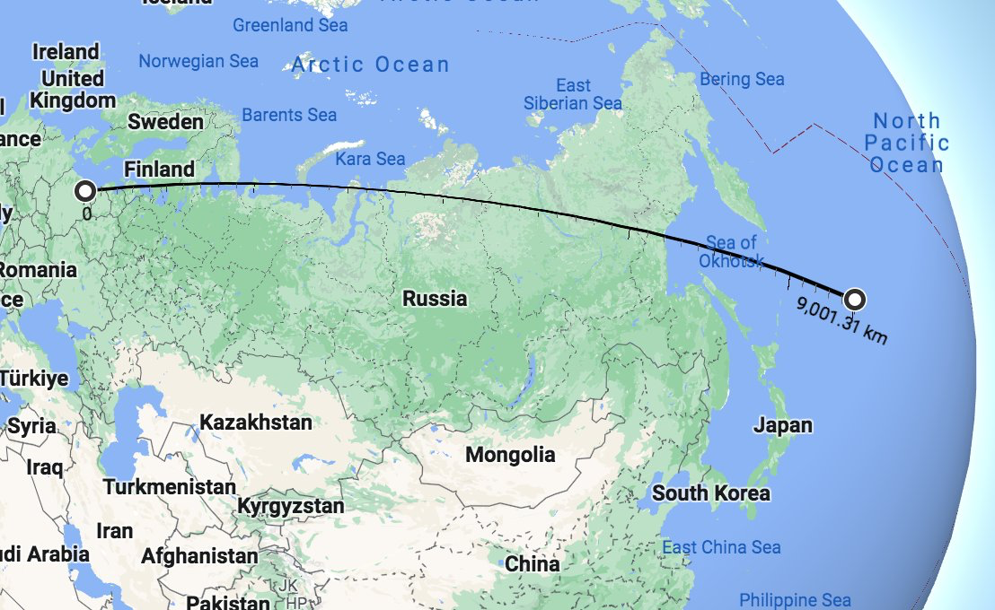
Update April 17, 2023: In the image below a long line across Russia is shown to be indicating a much shorter distance than a visibly shorter line across Africa. It's one that many people find hard to accept and that has been the subject of debate, involving Twitter Community Notes and the Encyclopedia Britannica.
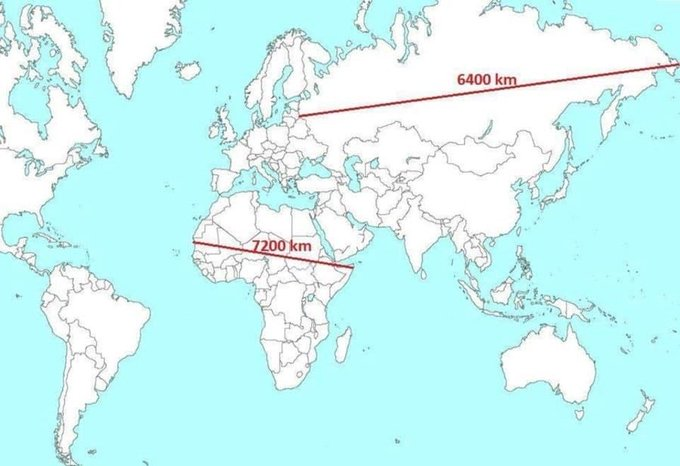
Tomas Pueyo tweeted a link to this blog post with this image as an example. And now Twitter has something called Community Notes that can be used by others to call out factual mistakes. In this case the Community Notes have been attached to his tweet with the following text, entitled "Readers added context they thought people might want to know":
False. Russia is east-west 5,600 miles (9,000 km) north-south 1,500 to 2,500 miles (2,500 to 4,000 km). Africa is east-west 4,600 miles (7,400 km) north-south 5,000 miles (8,000 km). britannica.com/place/Africa britannica.com/place/Russia
The first thing to note is that this comment does not attempt to measure the exact lines in the image but instead uses numbers from the Encyclopedia Britannica entries to assert that the supposed distances in the image could not be true. The second thing to note is that Britannica is misleading everyone when it comes to Russia. And that the distances shown in the image are in fact correct.
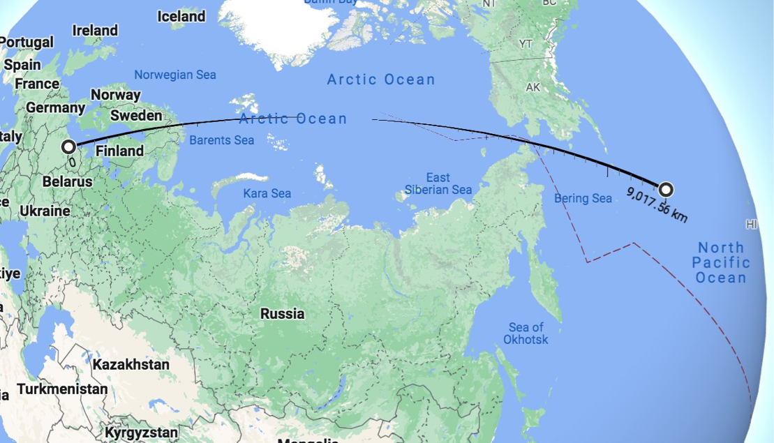
Thankfully Oscar Scafidi, of Scafidi Travels, did not accept the Community Notes at face value and decided to measure the distance. He writes:
I had to check this on Google Earth to confirm that it is accurate. It is!
He then goes on to demonstrate how he finds no way of measuring Russia to be 9,000 km across.
My first interaction with Community Notes...& they're incorrect! Although the @Britannica entry does say Russia is 9,000km wide, I can find no way of measuring it that wide using @googleearth , even if you go from Kaliningrad to Cape Dezhnyov, or Lavry to the Kuril Islands...
To illustrate this point he added some images:
Here is what happens if we head 9000km east from Kaliningrad:
Here is what happens if you head east from Kaliningrad to Cape Dezhnyov, and continue to 9000km...:
And here is what happens if we head 9000km from Kaliningrad to the Kuril Islands, and continue to 9000km...:
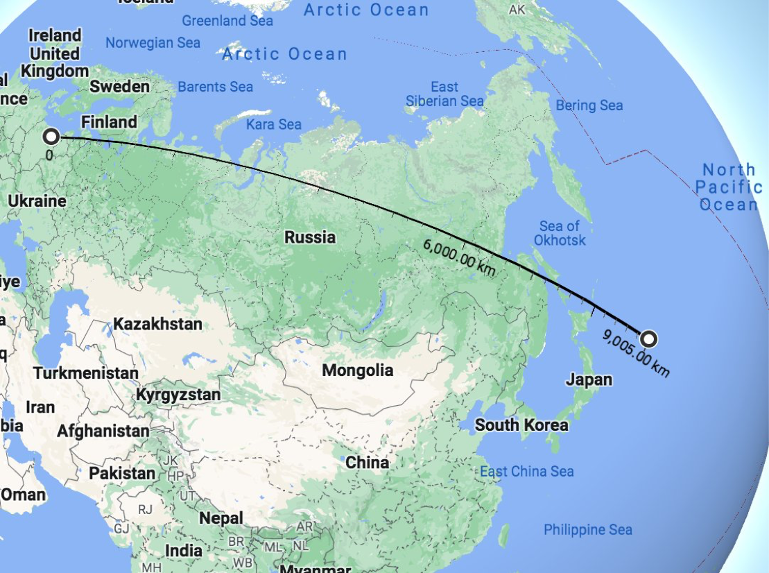
Yes, it would appear that the Encyclopedia Britannica is rather wrong about the distance East-West of Russia. And the Community Notes on Twitter are more harmful than helpful in saying something is false when it is actually true.
My favorite part of course is when Scafidi questions how the Britannica measurement of Russia can be so wrong ("contiguous Africa is wider than contiguous Russia") and shows that would happen if we applied the same standards of measurement to Africa:
The only way to measure Russia as wider than Africa is to BOTH start the measurement in the Kaliningrad exclave AND cross a sea (either the Sea of Okhotsk or sea of Japan). But if those are the new rules, then I'm measuring Africa as 10,500km wide, starting in Cabo Verde (an African country and member of @_AfricanUnion) and ending on the Mauritian island of Rodrigues, the easternmost point of Africa. 🤣

As you will have understood by now, the size of Africa is of course repeatedly underestimated. And the Mercator projection has a lot of responsibility in this misconception. Also: you can't always trust Britannica, or Twitter's Community Notes.
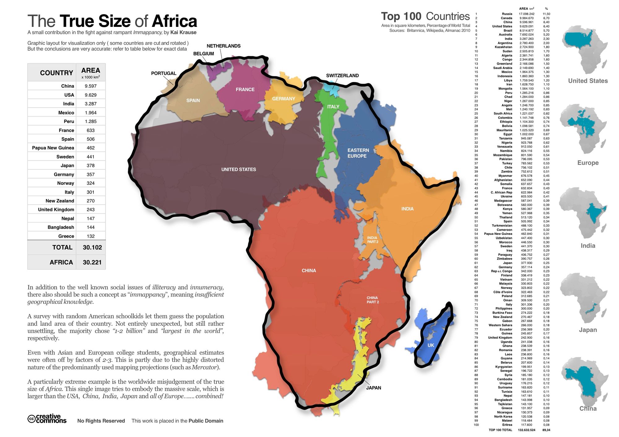
The True Size of Africa
Cartoons
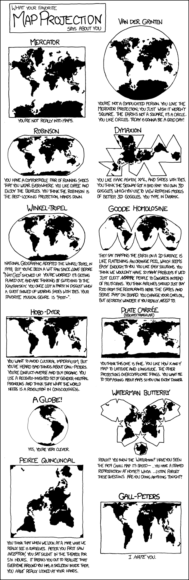
This XKCD cartoon has been mentioned to me quite a lot.
Ways to support Per's work
-
😊ShareCopy and share the link to this page.
Comments
Stefan Will – July 20, 2023
Apropos the straight line example, the sinusoidal shape reminds me of what circular satellite orbits look like when projected onto a mercator map. And it's hard to argue that those aren't "straight".
pb – April 8, 2023
Is it possible that the Mercator projection is commonly used in the USA simply because all of the early colonists arrived by sea and that's just the maps that they brought along? In Poland, the Mercator projection is simply shown as an example of an equiangular map, if at all, while the "standard" world map used in classrooms and school atlases uses the equal-area hyperelliptical projection.
crazy canuck – April 8, 2023
Thank you for this recap, I keep coming back to it to remind myself of the true size of countries, including Canada, which isn't as big as it seems.
Levent Heitmeier – April 5, 2023
This is definitely one of the best articles i have ever read.
Thom Sulfa – August 20, 2022:
The idea that retaining a map which distorting the sizes of countries is a Eurocentric conspiracy against equatorial countries was originally made by Peters when pushing his equal area projection in the 1970s and 80s.
It's a pretty tendentious argument though, since in addition to it obviously not being the original intent, people don't draw the conclusion that Greenland is a mighty state, the US is subordinate to Canada and the Middle East is a small and inconsequential backwater from map projections, and if people did gauge power and wealth from map projections, the Mercator projection would actually understate the actual relative power and influence of Western Europe anyway (and Peters massively overstates arid underpopulated regions and is barely any better at putting India's sixth of the world population in context).
Plus of course, the Mercator projection is still better for local navigation anyway for reasons not fully represented in this article. The author doesn't even get right the reason why the Mercator excels for navigation: constant rhumb lines. You set your course and you'll get to your destination without needing to correct (a great circle requires constant correction).
Per: Thanks for your input Thom. Yes, I don't think I myself would argue that the Mercator projection is a 'eurocentric conspiracy'. Rather, when I refer to 'colonial preference' my thinking is that the actions (or lack of actions) are often the result of bias and unawareness, and unwillingness to change that which works well enough to support one's own interests. So harm would potentially be caused by lack of care rather than insidious intent.
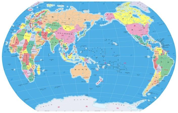
Of course there are a great many factors that will determine anyone's perception of geographical power structures, far beyond a map projection. But I believe it would be a mistake to discard a pervasive map projection as insignificant. This is also a very small part of the overarching point of the article, to encourage more rigid reflection and analysis of why some models prevail and others are discarded, and I do think these points are valid for that argument - even if the conclusion should be that the maps do not influence biased perception. I've added the example of China's world map to illustrate the idea that different countries will opt for different models of the same phenomenon, and often ones that align with self-image.
John Yesberg – August 21, 2022:
You describe that 32000km line as a "straight line", as though a line on the surface of a sphere can be straight. (To me, a straight line might be tangent to the surface at one point, or cross the surface at two points.) I think this would be a great opportunity to talk about great circles, rhumb lines, and other approximations of straight lines on projected geometries.
Per: While the context of this description hopefully gathers enough understanding to infer what I mean in this article, I do love this as a thought experiment. At what point is a straight line actually straight? If we take a piece of paper and draw a "straight" line with a ruler, is it this not a straight line because the paper itself is not perfectly flat but full of imperfections? If I ask you to walk in a straight line across my lawn, is that even possible? As it would seem, straight lines exist only in mathematics, and not truly within the real world. When it comes to sailing in a straight line, the human experience will often allow this 'clumsy' expression.
Sreader – August 21, 2022:
Great article.
Sebastian Lague has an excellent video on this topic while trying to make a game that lets you deliver packages across the globe - https://www.youtube.com/watch?v=sLqXFF8mlEU
Per: Thanks for sharing! This was a really beautiful experiment and cool way of taking on the challenge of mapping the flat map onto the globe. I was especially intrigued by the mountain ranges below oceans. I haven't really written much about the topography of the world.
Comment