1. UX is about asking users what they want
No. Just. No.
If users were able to articulate their needs then running a business and being an entrepreneur would be a walk in the park. If there’s anything I’ve learnt in my 18 years of user-centric design work, it is that humans — yes, you and me both — are eerily unaware of their own decision-making processes.
The past few decades we have seen immense progress in the art of understanding how people function emotionally, leading to many new insights into, for example:
- What motivates people
- What makes people feel good
- How new habits form
- How people make decisions
Many of these new theories actually overthrow old adages about how companies should approach and even advertise to customers. Gone is the view of humans as rational beings who make decisions based on logical reasoning. Embrace instead humans as they are, turning to intuition when too tired to read, making poorer decisions when grumpy and who want to buy from you because you have a pretty smile and you like cats.
But it really looks like you’re asking what users want?
I really do get where this myth comes form. We say we need to listen to users, we say we need to adhere to their needs. It seems obvious that to obtain this information that we ask them.
However, asking is not the preferred form of information retrieval in this case, even though it may look like that’s what many are doing. What we are really doing is talking, listening, observing and identifying patterns in behavior.
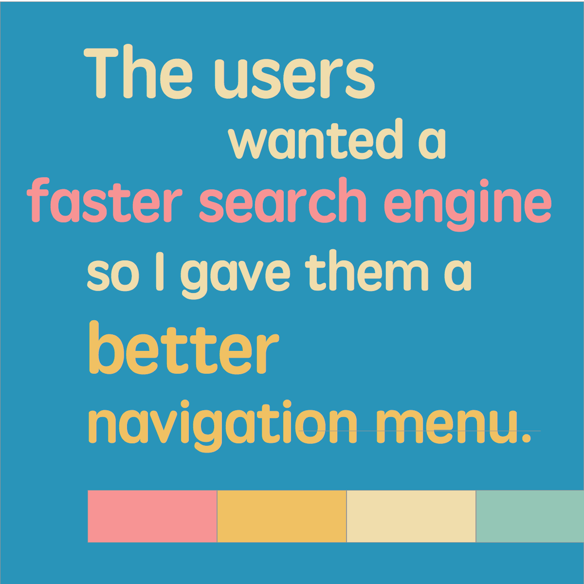
One person saying they “want a faster search engine” tells me nothing. Many people saying the same thing is a pattern. In interviews I may later discover that the reason they want a faster search engine is because what they most often are looking for isn’t part of the site navigation. In fact, creating a better menu may eliminate their need for a search engine altogether. So you see, there is a real difference to asking users what they want, and understanding the real problem.
The closest thing I’ve had to a user actually really telling me what she wants is when I did work for an insurance company. In response to questions about how she went about signing up for insurance she finally blurted out:
“I don’t care! I don’t care about all these options! Just give me ONE button that says, give me insurance. Let me click that and I’m done.”
In the end people don’t really want to use most of your services at all. They actually want to be done with them. It’s a giveaway that the world’s most popular site, Google’s search engine, is really successful by having people leave the site as soon as possible.
It’s my job to come up with the solution, but I can’t do that without first understanding the real problem. Users are rarely aware of the real problems but I can get to them by understanding their real pain points. That’s what user research is all about.
I just now realized I wrote a whole post about this in 2012: Don’t ask users what they want!
2. UX is about designing interfaces
No, but you wouldn’t be the only one confusing UX with interaction design. It’s true that many who are responsible for UX also master, or come from, interaction design. But mastering interaction design alone will not bring clarity to the experience of a service.
A person focusing solely on interaction design can create something that is appealing and easy to use, but UX infers an obligation to look at the bigger picture. To create something valuable it must also fit with
- business goals,
- available personnel and resources,
- as well as investments in other channels and touchpoints.
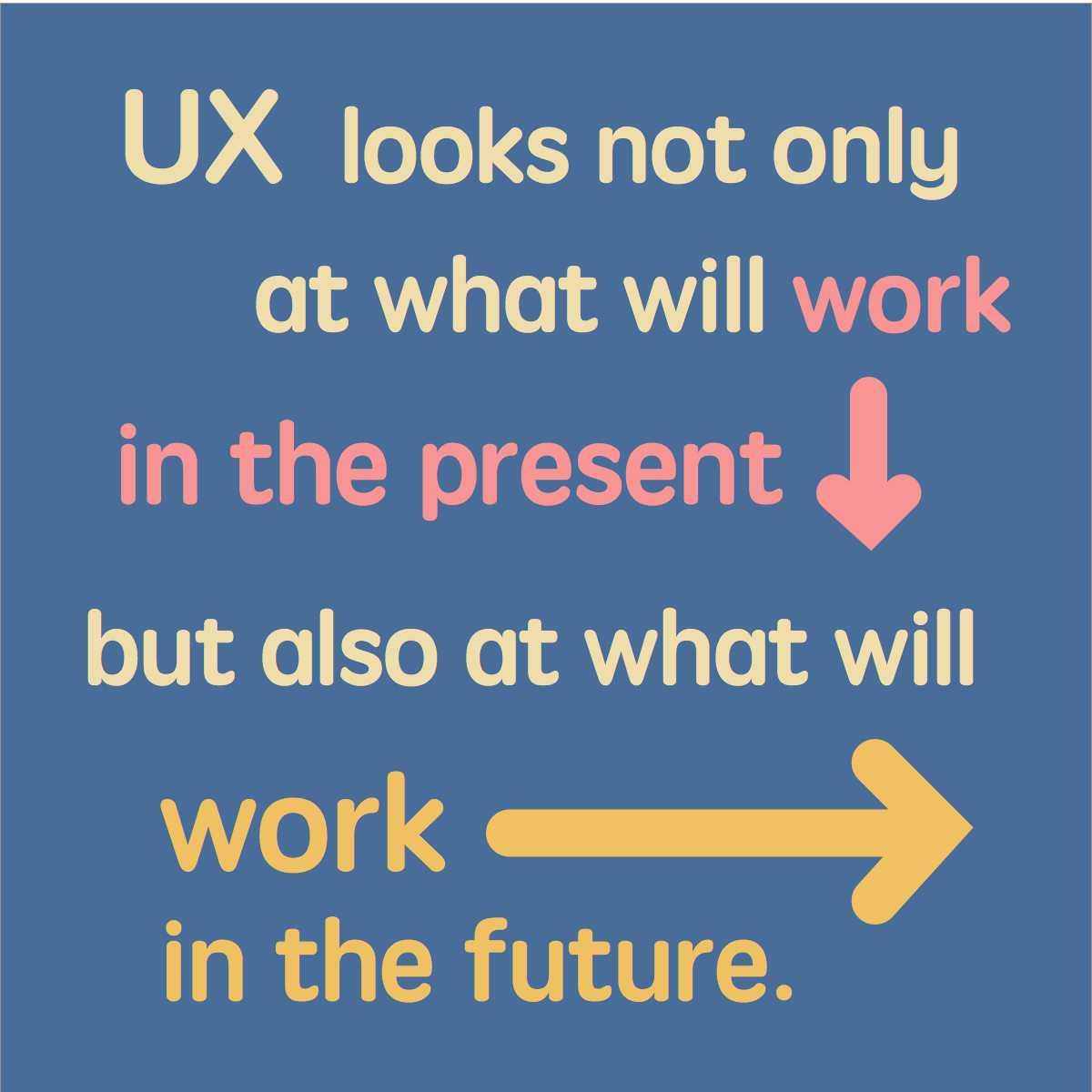
Hence, UX looks not only at what will work well for the users in the present, but also at what will continue working working well for the users in the future. To ensure this the solution must not place too much of a strain on the cost and effort required to maintain it, and it must not digress from that which makes the organization valuable.
An apparent, and common, risk is that we create something that is well received when it is first released but the organization does not have the resources to maintain the level of commitment to the service that it sets out to promise. Disappointment is not a recipe for success.
There should be a handover of user research from UX responsibles (that may not be what they call themselves, but you know what I mean) to interaction designers to ensure a design that is founded on context and real circumstance. And yes, to add to the confusion, many times these different roles are the same person.
Also read my post from 2011: The difference between an interaction designer and a UX designer
3. UX is about coming up with new, trendy solutions
No, UX is about understanding what solutions will create a win-win situation for an organization and the people it is targeting. Staying up-to-date with emerging technologies is absolutely important; a person responsible for UX should have a firm grasp of available options. And the appeal of innovative technology should of course always be considered.
It is not the search for the new and ultramodern, however, that should be the driving force behind UX work but rather the search for solutions that do the job well. They should prove powerful and superior, but within their own context and not always in comparison to media’s high-praised apps.
Working for Ericsson many years ago a web-based recruitment tool provided by a third-party supplier failed miserably in the tests we setup. The troubles were mainly with performance. The project was terminated and the supplier lost the contract.
More importantly, having worked closely with the target group (recruiters) for three months I was in a position to reinvent the solution.
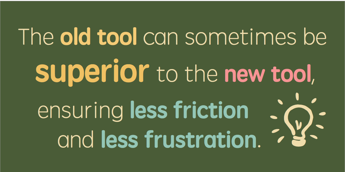
Using the insights I had gathered we were able to solve many of the user needs in a matter of weeks, using Microsoft Outlook, working with available filters and mechanisms for sorting and sharing across business units. This had many benefits:
- all users already had Microsoft Outlook on their computers
- users were already accustomed to having the application open all day
- the majority of applications (resumés, not software) coming in were already in Microsoft Outlook, there was hence no costly migration process
- there was very little learning curve — the interface was familiar
- there were no extra costs for the tool
To this day this project is my greatest reminder of how 3 months of user research allowed me to build a viable and valuable solution in 3 weeks, using a tool everyone was familiar with but had not even considered. It was very unsexy. It was extremely cost-efficient. The users had no objections.
Of course, the premise for my 3 months of user research was a large IT-project that failed and was scrapped in a matter of days. We can’t all be that lucky.
So, no, it doesn’t have to be new and fashionable. That will even scare some people away. There’s a lot to be said for second-hand stores. Just make sure the shoe fits.
4. UX is about making users understand instantly how it works
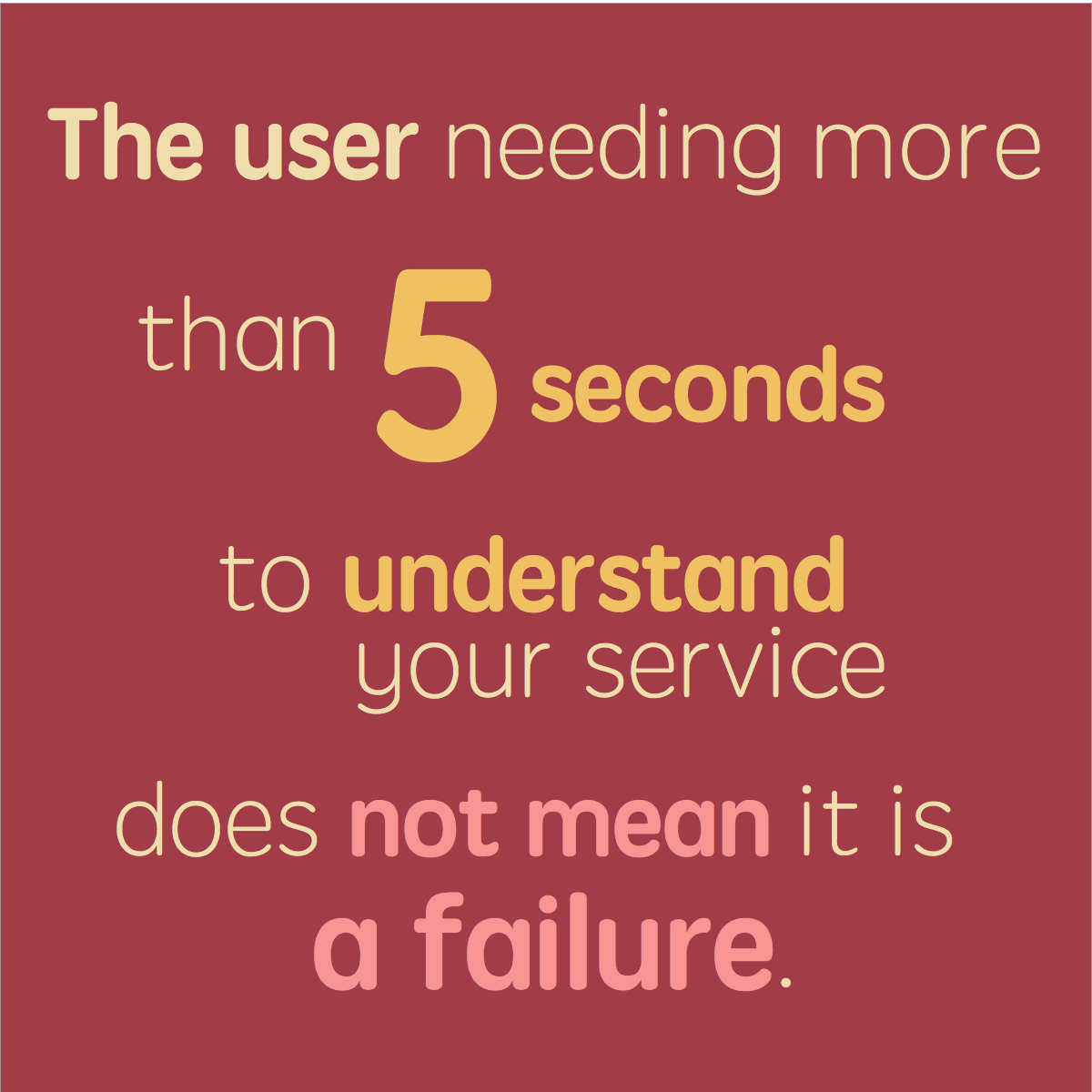
No, this is a frustrating myth that many people working with usability continue to strengthen by the way many usability tests are performed. If the users do not understand how to perform the tasks in a usability test, the conclusion is often that bad usability is to blame.
Then it’s back to the drawing board, searching for that holy grail of a design solution that people will grasp in an instant.
The very idea that everything can be designed for immediate comprehension is, however, pretty far-fetched.
Imagine usability testing children who are learning to ride a bike. After 50 or so children have tried straddling the bicycle and instantly fallen over, the bikes must surely be considered a failure. To me, bikes are pretty awesome though, once you learn to ride them.
And the next time I’m in a music store I think I’ll pick up a saxophone and play Jungleland. If I can’t I’m going to assume the usability testing was awry.
A focus on UX will allow the creation of a service that the target users can learn and become friends with, over time. It’s not always about love at first sight and not even about being the most valued tool in the toolbox. Not everyone can be a hammer; The wrench is valuable too, even though it may take a while longer to master.
5. UX is about digital experiences
No, UX is by no means limited to the digital space. On the contrary it is an understanding of all the touchpoints of an organization that will bring you insights enabling you to contribute to a coherent experience.
Currently working within the healthcare sector it may be true that I am designing a tool for online therapy, but my concerns stretch far beyond the tool. I map out the scenarios in which people will learn about the tool, what doctors say at the first meeting, what the introductory material on paper will look like, how they will talk to friends about it, how it fits into their weekly routines, what other health services they encounter, and what other related tools they use (be they digital calendars or physical sketchbooks).
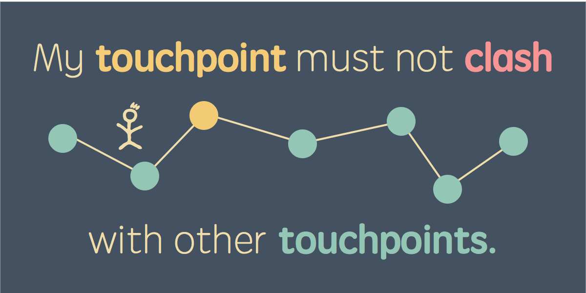
I work to ensure the part of the whole experience I am responsible for does not clash with the other touchpoints. Instead I pull on the familiarities of other interactions to reduce the overall friction and make the service more approachable.
When I say clash with the other touchpoints, this can happen in any number of ways: with regards to design, tone of voice, faulty links, how passwords are handled, having to enter the same information on multiple occasions, expectations put forward by information in other channels, how customer service responds to queries and so on.
I will most certainly speak up about how the different touchpoints should be engineered to work together, albeit I may not as a consultant have the mandate to affect them all. My understanding of the others will impact how I design but also how I interpret the results of user research.
As an advocate of UX I see it as my mission to share my insights and help others see what the concept of user experience means for organizations with many touchpoints and how they all work together to form the complete experience.
And yes, in the end, I think many of us see how one could work with UX and not deliver a digital solution. I myself sometimes turn to Frank and Lillian Gilbreth for inspiration in UX work, and they were born in the late 1800s.
Myths confine us
When myths are allowed to grow they quickly turn into walls and may limit us from moving into areas and obtaining information we need to perform well in our job. That’s why I make it a point to talk to anyone expressing the prejudices outlined in this article.
Make it a point to understand other people’s preconceptions of what you do. But don’t ever tell them they are wrong, that’s a lousy way to have a conversation, and that’s not what UX:ers do, right? Rather, listen closely to their story and share how your view of UX can be applied in situations familiar to them.
So remember to keep moving
I am far from correct in everything I do and conclude. It is not uncommon for me to feel like I’ve nailed a design solution only to learn that others fail to pick up on it in the way I anticipated. The key in these cases is to pursue solutions that work, keep learning about the situation, listening and being modest and humble in your approach.
Something in my user research always surprises me. If you are not being surprised, you are probably doing it wrong.
The world of services, especially online, is also now in constant motion and innovation, so sometimes you just have to get over yourself and move along with it. My stories are already a thing of the past and the field of UX is in continuous transformation.
You know, some years later the Microsoft Outlook solution I built was replaced by a younger and sexier web interface. And some day in the future we may very well have bicycles that children can learn to ride in a matter of seconds – well in fact they exist already, they’re called running bikes.
So when I lay awake at night, struggling with my definition of UX and how I can get others to understand my passion, my biggest consolation is this: As long as there are frustrations and friction there will be people like you and me actively trying to eliminate them, whether we call it UX or not.


Member discussion