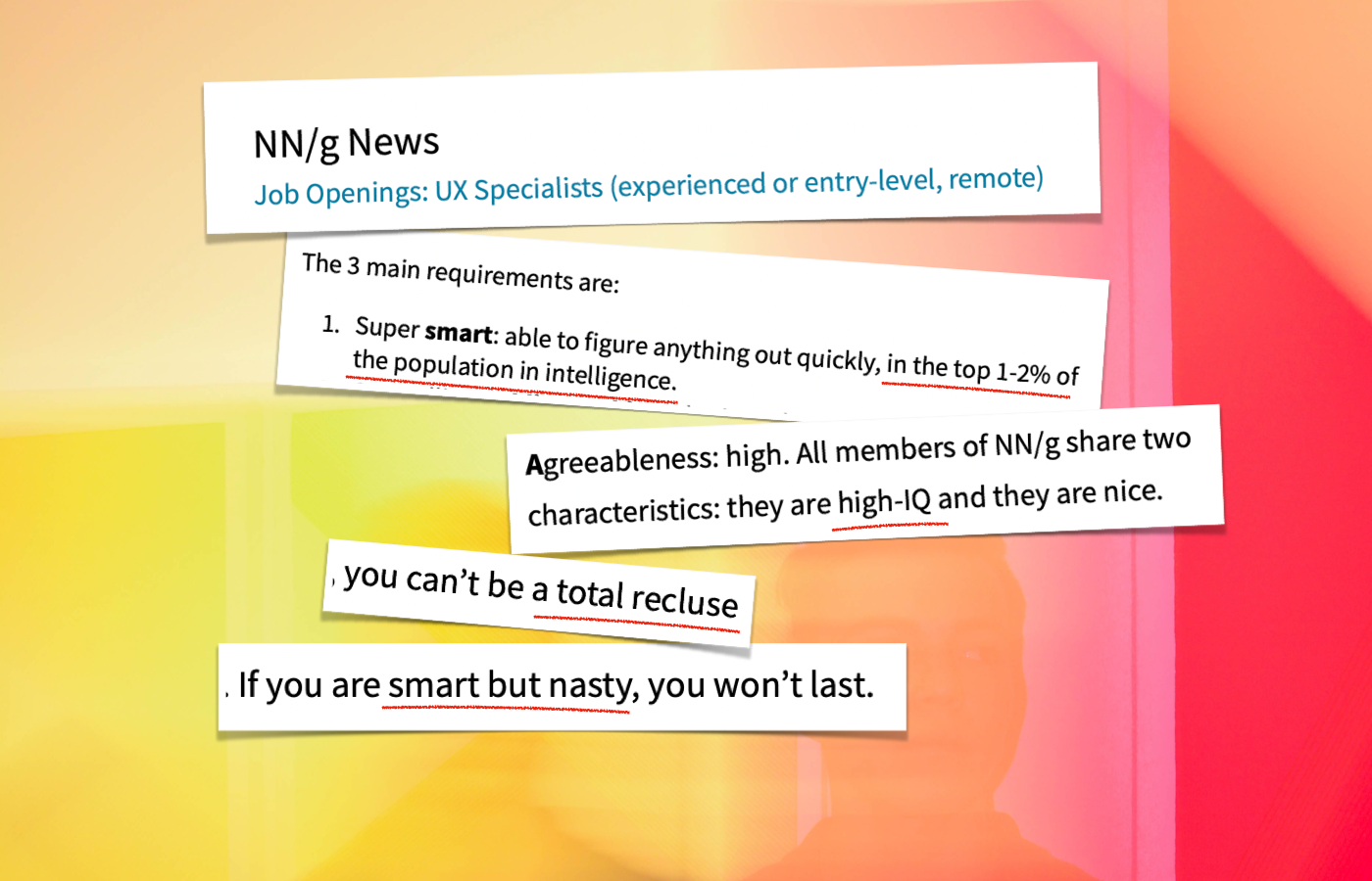
"Accessibility has failed as a way to make computers usable for disabled users." Thus begins a newsletter by Jakob Nielsen. And had it not been written by someone a great many people take seriously in the UX industry I likely would just have dismissed it. But seeing how harmful I consider the post to potentially be, I would like to nip this in the bud. My reflection is that the published post is misleading, self-contradictory and underhanded. I'll walk you through the whole of it and provide my commentary and reasoning.
First I would like to note that in the opening sentence accessibility could just as well have been replaced by usability or UX. You see, Nielsen uses it to make a point – based on his own observation – about how the fact that it can still be difficult to use computers is proof for a lack of improvement in accessibility across the board.
He writes:
"Assessed this way, the accessibility movement has been a miserable failure. Computers are still difficult, slow, and unpleasant for disabled users, despite about 30 years of trying."
By that same measure, the usability and UX movement has been a miserable failure despite more time trying.
I doubt that Jakob Nielsen would acknowledge that the industry he has worked in for 40+ years has failed miserably. But he appears to have no qualms asserting confidently as a basis for his article that people who have worked the same length of time he has, in a parallell industry, have failed miserably.
In a remark reminiscent of "I don't see color", he makes a point of clarifying that he himself differs from "the accessibility movement" in that he considers "users with disabilities to be simply users". He appears to dismiss the importance of recognising specific challenges.
If Nielsen generalises that computers are still difficult, slow, and unpleasant for disabled users, and also claims to see no difference between"simply users" and "disabled users", then how does he gauge the quality of his own industry? By the same logic it too must be a "miserable failure".
Reasons for failure
Rather than provide more foundation for the idea that accessibility has failed "miserably", Jakob Nielsen moves on to share his own opinions as to why this supposed failure has been unavoidable.
He offers no more than two reasons:
- Accessibility is too expensive as the undertaking of addressing all types of different disabilities is too much work, and
- Accessibility is doomed to create a substandard user experience, no matter how much a company invests.
Allow me to translate:
- In the first 'reason', the gist is that because we can't solve every issue there is no use solving any issue. It's just not worth paying the money for it.
- In the second 'reason', Nielsen gets away with claiming an always-true substandard user experience without really having to explain what that means. He alludes to a very specific 1-dimensional linear experience of blind users as being too limiting, with a clear disregard for how blind users navigate the web on touch screens. Ironically, he claimed in 2003 that blind users "think linearly".
Two other harms are happening here:
- Jakob Nielsen is telling companies that they are right not to invest in accessibility (it's too expensive and it won't give the desired result anyway). Nielsen is undermining the very important work that is happening right now inside organisations and has been going on for decades. Real work that is helping real people.
- Nielsen fails to mention that lack of training or understanding of digital accessibility contributes to any perceived failure . This is worth pointing out as Nielsen Norman Group offers training in accessibility. In my own experience the lack of training can be a key contributor to a slower progress than is otherwise possible.
I'm far from done, but just to be clear, before I go on: there is of course no "miserable failure" in accessibility. There has been continuous improvement in hardware, software and interfaces year-to-year. Is there still a long way to go towards addressing accessibility in the digital space? Of course, just as there is in any industry. But if in doubt about what improvements look like please spend some time with these examples in the always readworthy Axess Lab blog. I'll meet you back here.

Two groups singled out
Jakob Nielsen goes on to single out two groups of disabled users that "can be helped by current approaches". He writes this as if they are the only two groups that can be helped, which of course is a farcical presumption, but here we are. He says they are old users and low-literacy users.
This whole section is a little muddy and non-cohesive but it's full of numbers about how many people are encompassed by these groupings and how much money they represent. You should really be thinking about the money, according to Nielsen:
"Estimates from international reading research show that about 40% of the adult population in the United States can be classified as having low literacy. (This is about 100 million customers. Think dollar signs when you read these statistics.)"
"Think dollar signs." But also, don't think of them as anything but "simply users". I hope someone is keeping count of the many contradictions.
I have to also say, this sentence does not sit well with me: "The second immense group of disabled customers consists of low-literacy users." I'm not confident we can readily define this as one large "disability group". It's more relevant to recognise that low-literacy is often tied to many other disabilities.
Addressing and singling-out low-literacy because you are thinking "dollar signs" may actually then be a formal fallacy, because you are not seeing the complete picture of needs. If you aren't addressing the other disabilities as well, the potential gains from addressing only literacy means you're still not reaching those 100 million people. I'm not surprised this topic comes up, though, as I know Nielsen has spent a great deal of time thinking about IQ.
A straw man alternative description
In his apparent effort to double down on alienating himself from accessibility experts, this section also contains an "aside", which has to do with an image description.
He has generated a poster using an AI tool, and then he has generated a description of that poster. The poster is an illustration of bear wearing a hat in front of a forest, and a heading across the top that reads "Make it easy". He has then used ChatGPT to generate a description of that poster that is very long and detailed, with a total of 69 words and 403 characters.
In what can only be interpreted as an attempted dig at what he calls the "accessibility movement", Nielsen contends that this is an example of an image description that many accessibility advocates would insist on. And goes on to profess that it would be much better to choose something shorter that doesn't interrupt the flow of reading.
The premise that accessibility professionals would advocate for this particular description is of course simply not true. For decades it has been taught that alt text is reliant on the context of where an image appears on a page and how it is described in the surrounding text. This is not far from what Nielsen claims to be the better approach, but he fails to acknowledge that this is exactly how it has always been taught.
Which makes you wonder how Nielsen-Norman Group teaches it.
This is of course a textbook example of a straw man argument. A stance by accessibility professionals has been misrepresented and dismissed as inferior. In reality, there is no argument and no point has been made.
Wait, did he use ChatGPT for that description?
One thing you should bring with you in mind as we jump to the next section is that Nielsen used a generative tool to create that image description, and went on to argue that the output from that generative tool was less than adequate. He will soon argue that generative tools are superior when it comes to solving this.
Generative UI to save the day!
As he gets ready to introduce the magical thinking of relying on AI to solve all this, Nielsen again repeats the sentiment that if you can't do everything, you shouldn't do anything. You could conduct user testing with representative people, but Nielsen asserts that "This will never happen, so let’s forget about an unreachable ideal."
Never mind that it is already happening all over the place. Again Nielsen is giving material and arguments for organisations who are looking for excuses to drop their investments in accessibility.
The personalisation to rule all personalisation
What Nielsen goes on to describe as a predicted and preferred way for managing accessibility is a reliance on generative AI tools to simply produce unique interfaces, texts and sound for each and every user who accesses a website. No, really.
This is how Nielsen describes it:
In this second-generation generative UI, the user interface is generated afresh every time the user accesses the app. Most important, this means that different users will get drastically different designs. This is how we genuinely help disabled users. But freshly generated UIs also mean that the experience will adapt to the user as he or she learns more about the system. For example, a more simplified experience can be shown to beginners, and advanced features surfaced for expert users.
It's hard to know where to begin here, so I'll start by just gawking at the metaphor that is used to describe how UX designers have already been through a loss of designer control and should appreciate that this is just another one of those shifts. Nielsen writes that this change "is very similar to the change introduced by responsive web design."
Moving from a pixel-perfect design for desktop computers to designs that adapt to screen widths is, according to Nielsen, very similar to handing over control to what each user sees and hears to generative AI. I must admit I fail to see the similarity.
Objections
I'm certainly not the only one to react with bewilderment at this type of proposal by a proclaimed usability engineer, and someone who generally could be thought to have an understanding of how the internet works, but let me just list a handful of my concerns.
- Lost predictability. Many people rely on predictability and consistency for recall and feelings of control. Not knowing what to expect exacerbates many accessibility dilemmas.
- Lack of traceability. How can I trust any screendump of my website? The wayback machine will have a field day.
- Carbon costs. Thinking about the processing power and compute required for all websites to generate unique interface on the fly is frankly terrifying.
- Surveillance amplification. To assess the needs of each user requires a deep mapping of those needs that also then need to be conveyed to the browser or website. The suggestion is surveillance-centric, a threat to integrity and full of failure points when that data isn't complete.
- Radical individualism. This forces a move away from shared experiences, for example when two people are using the same website, each on their own computer.
- Support. Providing support to someone (not unheard of when users struggle) encounters a huge obstacle when the interface is unpredictable and not shared between the two people talking.
- Ineffectual testing. Adequate research and user testing will become irrelevant and organisations will rely on heaps of move-fast-and-break-things mentality to learn anything. So much for this shift being "very similar" to responsive design.
- User endangerment. Synthetic translations, rewrites, summaries and images will always have a risk of not adhering to the original in a way that can propose content that puts users in harms way if they for example follow advice, checklists or purchase recommendations.
- Foggy legal issues. If something is generated that is not in compliance with terms elsewhere, who wins disputes?
Feel free to suggest your own additions or amendments to this list in the comments.
Does AI play a role in user experience in the future?
The door is wide open to claiming that users will in many cases use voice, text, keyboards and eye-trackers in the future to ask AI assistants to navigate and fetch content for them under their own supervision. Something that could mean volumes for accessibility without requiring any new interfaces at all for existing websites. But a unique, individualised UI for each user, generated without supervision by any designer, is an extreme take with very little foundation in feasibility or desirability.
And it leaves an especially bad taste when it's suggested in the same breath as calling a proven, sustainable industry focused on compassion and inclusivity a "miserable failure".
Per Axbom has worked with digital accessibility for more than 20 years. He has written a free, Swedish e-book on the Web Content Accessibility Guidelines (Digitill.se) and strives every day to make tech more safe and compassionate through design. He also works with usability and used to read Nielsen's Alertbox in the 90s.
More reactions
"Jakob Nielsen thinks that accessibility has failed.
I give this some thought as I make my lunch with ingredients I purchased from an online grocery store. I keep thinking about it as I return to my desk and respond to a few emails using my online mailbox. I check my online calendar for upcoming meetings (there are two, both to be held using one ubiquitous VOIP platform or another), and I keep thinking about it."
– Léonie Watson with the perfect response in her post 'Nielsen needs to think again'
"Overall, Nielsen's article spreads a lot of misconceptions about the value of digital accessibility, a designer's role in creating accessible outcomes, and how generative UI and AI can create accessible/custom experiences."
– Anna Cook on LinkedIn

by Matt May

"Jakob Nielsen has done more in one article to tear down #accessibility and delude people into thinking we really should be using #GenAI instead of making things accessible than he has built in his entire career.
Don’t get me wrong, GenAI has many accessibility uses, but it is not even close to ready to developing individualized #UX experiences for people with disabilities.
Don’t buy his snake oil. It’s bad enough accessibility activists have to fight overlays, now we have to fight this too?"
– Sheri Byrne-Haber on LinkedIn


➡ Nielsen and Norman should be ignored (linkedin.com) by Debbie Levitt
Related reading


Comments
March 2, 2024 • Marcelo Sales:
Sorry for my not so good English, I'm using Google translate:
I was negatively surprised by Nielsen's text as soon as a student and friend shared it with me. My biggest concern is the fact that Nielsen is relevant to the industry and some paths that can be directed towards his text.
Your text was very punctual and I would like to add just one more item that I mention in classes and that is associated with my concern.
In 2011 Nielsen advocated the creation of "2 separate designs" for desktop and mobile (https://www.nngroup.com/articles/optimizing-a-screen-for-mobile-use/)… Ethan Marcotte had just established the standards for Responsive Web Design (2010) and perhaps Nielsen was oblivious to all this movement…
In 2012 Nielsen again stated that we should have “two designs, two sites and cross-links to make it all work” (https://www.nngroup.com/articles/mobile-site-vs-full-site/).
And if nowadays we have people still believing that we should have 2 versions of content for mobile and desktop, we owe it in part to Nielsen's ideals that spread over the following years... :(
Anyway... what bothers me and worries me is that some people will read Nielsen's text and understand what they want to understand simply because they also don't understand that the biggest problem is the lack of qualifications of the people involved in the projects, regardless of their level of expertise. knowledge (which just proves that experts are not necessarily “experts” in everything, but some people don’t care about that)… 😦
March 8, 2024 • Per Axbom
Thank you for your comment Marcelo. I've provided this link as context for readers:



Member discussion